How to create interactive tooltips in Power BI (step by step)
One of the easiest ways to impress your audience with Power BI is a tooltip. This simple idea can provide incredible value to the report readers and elevate your work to next level. In this easy tutorial, learn how to set up and work with tooltips in Power BI.
Power BI Tooltip
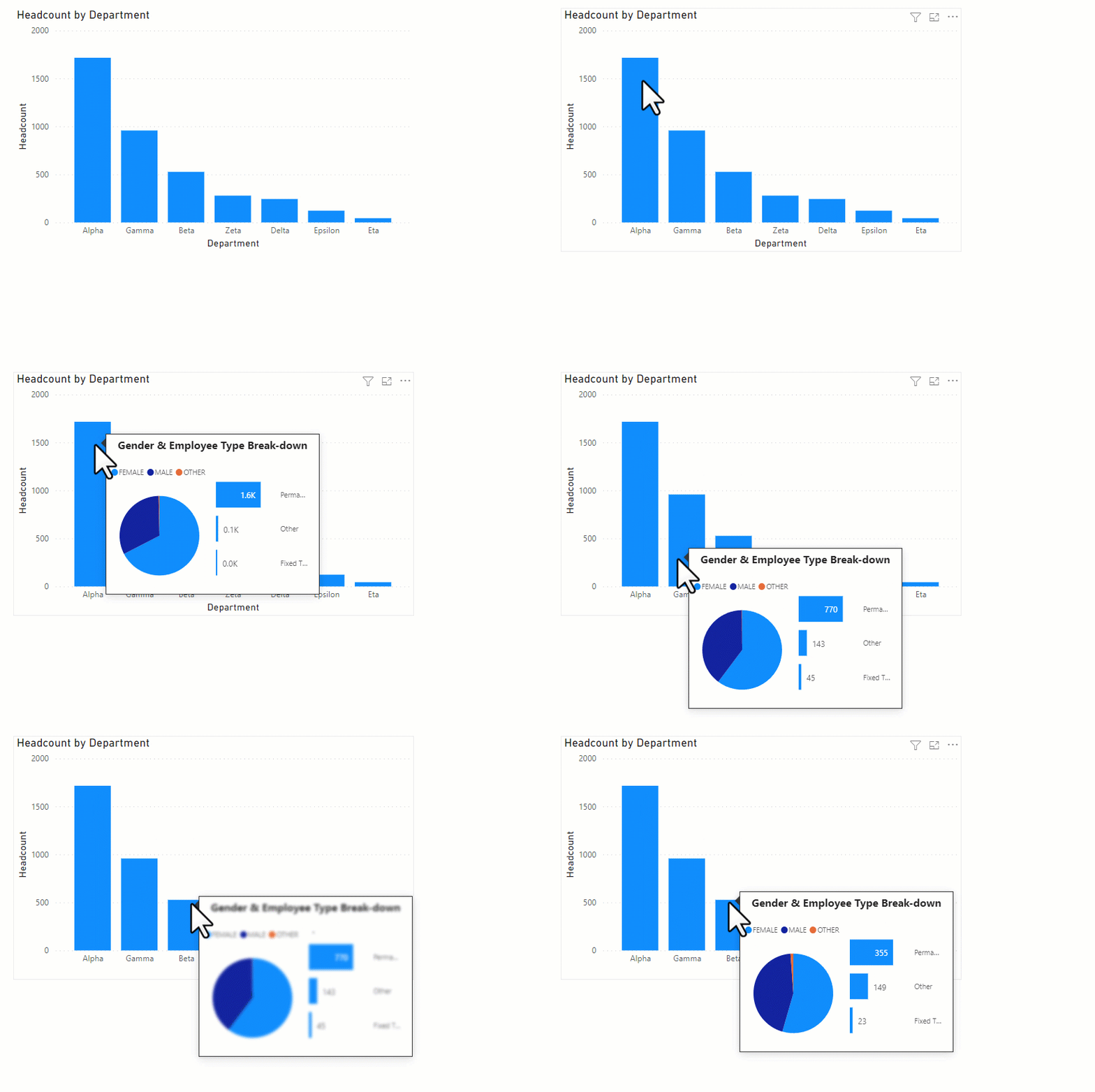
A quick demo
Create a visual on the page where you want your tooltip. Let’s say you want to show the headcount by department in a column chart, like below:
Insert a new Power BI report page. Click anywhere on the page and go to “format page” area, in the format pane.
Setting up a tooltip page
On this “new” page, just add whatever visuals, images & textboxes you want to show. For example, I want to show gender & employee type distribution. So I added those visuals.
? Tip: Make sure you give your “tooltip” page a name.
Go back to the report page. Select your main visual. Then link it to the tooltip page using below steps.
Voila! Your tooltip is now set up.
Here is a short & sweet video tutorial of this process. Do watch it, if you need any help.
So what are you waiting for? Give them a try.
Want to learn Power BI? Check out below articles + videos.
The post How to create interactive tooltips in Power BI (step by step) appeared first on Chandoo.org – Learn Excel, Power BI & Charting Online.


